The word “dashboard” has been stretched well beyond its original meaning in construction. It now describes everything from a single-project status page to a multi-panel executive view covering a portfolio of thirty active projects. The problem is not that dashboards are built. It is that most of them are built around data availability rather than around the decisions the people reading them need to make.
A dashboard that shows only what is easy to report, percent complete, milestone status, and submitted RFI counts, tells a project team where the project has been. It does not tell them where it is going or where the pressure is building before it becomes a problem. The gap between a dashboard that documents history and one that supports decisions in time to matter is the central design challenge in construction risk reporting.
Understanding what belongs on a risk dashboard, how to organize it for different audiences, and what data inputs it depends on is essential for any project controls function that wants its reporting to drive action rather than just record outcomes.
Why Risk Dashboards Fail in Practice
The construction industry is operating under conditions that make rigorous risk visibility more important than ever. KPMG’s Global Construction Survey 2025/2026, drawing on perspectives from 375 industry leaders, found that 75 percent of construction executives reported being equally or more risk-averse than twelve months earlier, amid what the report describes as a widening “risk delta” between mounting project risks and a shrinking appetite to absorb them. In that environment, a dashboard that tells executives what already went wrong is not just unhelpful. It is the wrong tool for the conditions the industry is actually operating in.
Most risk dashboards fail for one of three reasons. First, they present lagging indicators as if they were leading ones. A schedule performance index reported at the end of the month reflects decisions and events from the previous four weeks. By the time it appears on a dashboard, the opportunity to respond to the conditions that drove it has passed. Second, dashboards aggregate too early. Averaged metrics across a portfolio conceal individual projects in distress. A portfolio SPI of 0.95 looks healthy; it may contain three projects at 0.70 and several at 1.0 or above balancing them out. Third, dashboards are not tied to a defined decision framework. When there is no agreed threshold for what triggers a conversation, a color change on a chart means different things to different readers, and no action consistently follows.
The Three Layers Every Risk Dashboard Needs
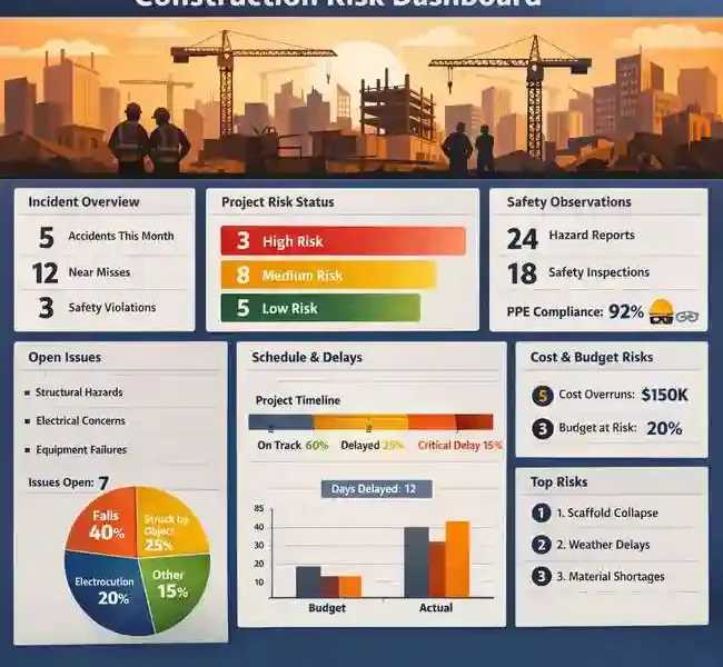
A well-designed construction risk dashboard is not a single view. It is a layered system that serves different audiences at different levels of resolution, all drawing from the same underlying data.
The portfolio layer is for executives and VPs of Operations. It shows the health status of every active project in the program, organized to surface the projects that need attention. Color-coded indicators work well here: green for projects tracking within defined thresholds, yellow for projects showing early warning signals, red for projects where corrective action is already required. What matters at this layer is the ability to identify which projects need a closer look, not the specific mechanics of why they are struggling.
The project layer is where a construction risk dashboard earns its keep for the project controls team. At this level, the dashboard needs to show the specific metrics that reveal where risk is concentrated: float distribution across the network, schedule performance index trend over recent periods, critical path stability (whether the critical path has shifted since the last update), and compression ratio as an indicator of whether the remaining schedule is sustainable given current performance. These are the metrics that give a project controls manager something to act on, not just something to report.
The activity layer is for project managers and field superintendents. It surfaces near-critical activities: those with float values low enough that a modest disruption would push them onto the critical path. This layer answers a practical question: which specific activities need focused attention this week? It is the most operationally immediate level of the dashboard and the one that most directly influences day-to-day decisions about resource allocation and sequencing.
The Color-Code Framework: Design It Deliberately, Not Intuitively
Color-coding in project dashboards sounds simple. In practice, it requires deliberate design to function as intended. The thresholds that separate green from yellow and yellow from red need to be defined before construction starts, based on the specific risk tolerance of the project or program. Default industry thresholds are a starting point, not a substitute for project-specific calibration.
Government capital programs have long modeled this approach. The U.S. Department of Energy’s Office of Project Management publishes a monthly project dashboard for its portfolio of capital asset projects that classifies each project as green (expected to meet performance baseline), yellow (at risk of breaching performance baselines), or red (expected to breach performance baselines). The classification is grounded in defined cost and schedule performance criteria, not subjective assessment. That grounding is what makes the color meaningful: every stakeholder knows exactly what each status indicates and what response it is supposed to trigger.
Commercial construction programs benefit from the same clarity. A risk dashboard where yellow means “someone thought this looked a bit concerning” is not a risk management tool. Yellow should mean: this project has crossed a defined threshold on at least one tracked metric, and a defined response is now required. That response might be a review meeting, a recovery plan submission, or a senior leadership briefing. What it must not be is optional.
Leading Indicators vs. Lagging Indicators: Getting the Mix Right
The distinction between leading and lagging indicators is fundamental to risk dashboard design. Lagging indicators confirm what has already happened. Leading indicators signal what is likely to happen if current conditions continue.
The most common lagging indicators on construction dashboards are planned versus actual percent complete, milestone variance, and cost performance index. These are worth tracking, but they are retrospective by nature. They describe the project as it was at the end of the last reporting period.
Leading indicators require a different set of inputs. Float erosion rate, meaning how quickly activities are consuming their float between updates, is a leading indicator of critical path pressure. Schedule stability, measured by how much the critical path changes between updates, is a leading indicator of plan reliability. Near-critical path density, the proportion of activities within a defined float threshold, is a leading indicator of how sensitive the schedule is to further disruption.
AACE International’s Recommended Practice 132R-23, which defines a maturity model for schedule risk analysis, identifies a clear progression: organizations at lower maturity levels track risk through lagging qualitative assessments, while more mature organizations integrate quantitative leading indicators into their monitoring cadence. A well-designed risk dashboard reflects that maturity by deliberately mixing both types of indicators, using lagging metrics to confirm trends and leading metrics to flag emerging conditions early enough to respond.
The Data Quality Prerequisite
No dashboard design compensates for poor underlying data. A risk dashboard that pulls from a schedule with logic gaps, artificially constrained activities, or inconsistent update practices will surface metrics that do not reflect the project’s actual condition. Float values drawn from an unreliable schedule are not a useful basis for risk classification. SPI calculated against a baseline with unrealistic durations does not measure real performance deviation.
This is why the conversation about dashboard design should always start with the conversation about schedule quality. Before deciding what to show, the project controls team needs to establish that the data feeding the dashboard is sound. That means schedule quality checks at each update cycle, a defined process for resolving logic deficiencies before metrics are calculated, and a clear understanding of which metrics are reliable at which stages of the project.
The dashboard is the visible output of a project controls process. Its credibility depends entirely on the quality of the process that generates its inputs. Teams that invest in rigorous schedule maintenance get dashboards that tell them something real. Teams that skip that step get dashboards that look informative and are not.
Designing for Action, Not for Reporting
A construction risk dashboard designed for action looks different from one designed for reporting. A reporting dashboard shows everything that can be measured. An action dashboard shows the specific metrics that trigger specific decisions, at the level of resolution appropriate to each audience, with defined thresholds that make the next step unambiguous.
Building that dashboard requires deciding in advance what green, yellow, and red mean for each metric. It requires agreeing on which metrics are leading and which are lagging, and presenting them together so readers can distinguish between current status and emerging trend. It requires building the portfolio layer to surface distressed projects rather than averaging them away. And it requires tying the color-coded outputs to a defined response protocol so that a change in status initiates a specific action rather than a general sense of concern.
Construction risk dashboards fail when they are built to demonstrate that reporting is happening. They succeed when they are built to make the right conversation happen faster.