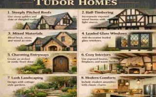
Mid-century modern home colours are loved for a reason: they feel warm, stylish, and easy to live with. This design style first became popular in the middle of the 20th century and still looks fresh today because it blends simple shapes with colours inspired by nature.
If you want a home that feels calm but still full of character, colour is one of the most important choices you can make. Mid-century spaces often use earthy neutrals, rich wood tones, and bold accent shades to create a balanced look. The result is a home that feels both retro and modern.
Understanding Mid-Century Modern Design and Colour Philosophy
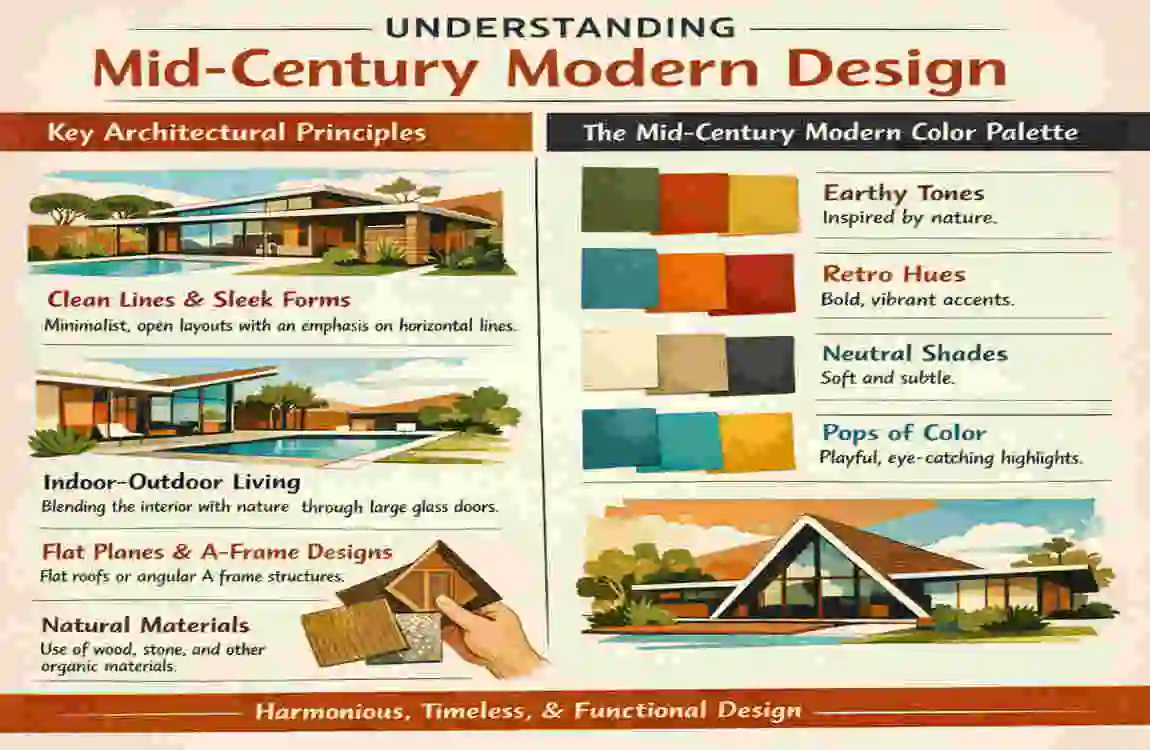
What Defines Mid-Century Modern Style?
Mid-century modern design is known for clean lines, simple shapes, and practical beauty. It avoids heavy decoration and instead focuses on open spaces, natural light, and smooth connections between indoors and outdoors.
You often see wide windows, low roofs, and materials like wood, stone, glass, and metal. The style feels light, functional, and relaxed.
Why Colours Matter in Mid-Century Homes
Colour helps bring this style to life. The right shades can highlight a home’s strong lines, soften hard edges, and create a warm feeling.
Mid-century homes often use colour to do three things:
- Show off architecture
- Add warmth to natural materials
- Create a stylish retro mood
Characteristics of Mid-Century Modern Home Colours
The best colours for this style usually include earthy tones, muted neutrals, and bold accent colours. These shades work well with walnut wood, brick, stone, and other natural finishes.
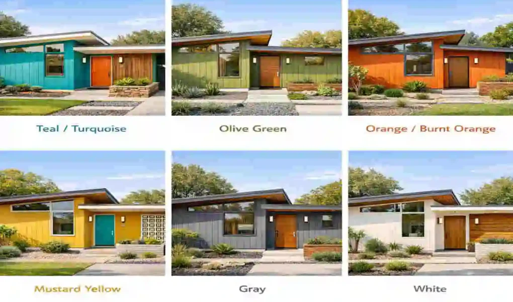
You’ll often see colours like olive, mustard, rust, teal, cream, and warm brown. These are classic mid-century modern colour palette choices because they feel timeless and grounded.
The Most Popular Mid-Century Modern Home Colours
Mustard Yellow
Mustard yellow is one of the most recognisable retro colours. It brings energy without feeling too bright or overwhelming.
It works well as an accent on pillows, chairs, art, or even a front door. If you want a cheerful touch that still feels vintage, this is a strong choice.
Olive Green
Olive green feels natural and calm. It pairs beautifully with wood, leather, and stone, making it a favourite in earthy mid-century colours.
Use it in living rooms, kitchens, or on exterior siding for a soft, organic look.
Burnt Orange
Burnt orange adds warmth and personality. It has a strong vintage feel and is often associated with classic retro home colour schemes.
This colour works well in rugs, accent walls, and decor pieces. It gives a room character without taking over the whole space.
Teal and Turquoise
Teal and turquoise are bold but elegant. These colours were popular in the mid-century era and still feel stylish today.
They work especially well in bathrooms, kitchens, and statement furniture pieces. If you want a bit of drama, these shades are a smart pick.
Avocado Green
Avocado green is a true vintage colour. It brings a nostalgic feel that connects directly to the era.
Today, it works best in smaller doses. Try it in accessories, tile details, or accent furniture rather than on every wall.
Walnut Brown
Walnut brown is one of the most important shades in mid-century modern home colours because it matches the wood often used in this style.
It grounds a space and adds richness. Whether in furniture, panelling, or flooring, walnut helps everything feel connected.
Warm White
Warm white keeps the room bright but not cold. It creates balance and helps stronger colours stand out.
This is a great base colour for walls because it lets you add bold accents without making the room feel busy.
Best Mid-Century Modern Exterior Colour Schemes
Charcoal Grey with Wood Accents
This combination feels modern but still true to the style. Charcoal gives the home a strong shape, while wood keeps it warm and welcoming.
It works especially well on homes with large windows and simple rooflines.
Olive Green and Cream
Olive green and cream create a soft, nature-inspired look. This is a great choice if you want your home to blend in with trees, gardens, or earthy landscaping.
The palette feels calm and elegant without looking plain.
White and Teak Wood
White paired with teak wood creates a clean, timeless look. It is simple, bright, and very easy on the eyes.
This combination works well if you want a minimalist, vintage-modern colour palette that still feels warm.
Mustard Yellow Front Door with Neutral Exterior
A mustard yellow front door can instantly lift a plain exterior. It adds personality while keeping the rest of the house simple.
This is one of the easiest ways to add mid-century charm without repainting the whole home.
Black, Brown, and Stone Combinations
This mix feels rich and grounded. Black adds contrast, brown adds warmth, and stone adds texture.
It is a strong choice for homeowners who want a more dramatic but still classic look.
Exterior Colour Selection Tips
- Think about landscaping so the home and yard feel connected.
- Match existing materials like brick, stone, or wood.
- Balance bold and neutral tones so the exterior feels stylish without being too loud.
Best Mid-Century Modern Interior Colour Palettes
Earth Tone Palette
This palette includes brown, rust, olive, and beige. It feels warm, cosy, and natural.
It works well in living rooms and bedrooms where you want a calm and grounded mood.
Retro Vibrant Palette
This one uses mustard, teal, orange, and walnut. It has more energy and is perfect if you love the classic mid-century look.
Use this palette when you want a room that feels playful but still tasteful.
Scandinavian Mid-Century Palette
This palette includes white, light wood, soft grey, and sage green. It is lighter and more minimal.
It works best if you like a clean, airy space with a soft modern feel.
Desert Modern Palette
This style uses sand, terracotta, camel, and warm white. It feels sun-soaked and relaxed.
It is a great choice for homes that want a cosy, natural look with a touch of southwestern influence.
Contemporary Mid-Century Palette
This palette combines navy blue, charcoal, wood tones, and brass accents. It feels more refined and updated.
Choose this if you want mid-century style with a more modern edge.
How to Choose the Right Mid-Century Modern Home Colours
Consider Natural Light
Light changes how colour looks. A room with lots of sunlight can handle deeper shades, while a darker room often needs lighter colours.
South-facing rooms usually feel warmer, so cooler tones can help balance them. North-facing rooms often need warm shades to avoid feeling flat.
Highlight Architectural Features
Use colour to draw attention to the home’s best features. If you have wood beams, brick fireplaces, or large windows, let them stand out rather than hide them.
This is one of the simplest ways to make the space feel authentic.
Use the 60-30-10 Rule.
This is an easy way to build a balanced palette:
- 60% dominant colour for walls or large surfaces
- 30% secondary colour for furniture or major features
- 10% accent colour for decor and details
This Rule keeps the room from feeling too busy.
Coordinate with Furniture and Décor
Mid-century design works best when colours and furniture support each other. Walnut chairs, leather sofas, brass lamps, and simple artwork all help complete the palette.
Colour Mistakes to Avoid in Mid-Century Modern Homes
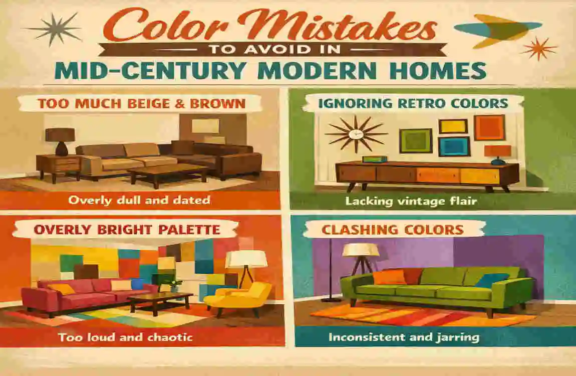
Using Too Many Bright Colours
Mid-century design allows bold colour, but too many loud shades can make the space feel scattered. Pick one or two strong accents and keep the rest calm.
Ignoring Natural Materials
Wood, stone, and leather are important in this style. If your colours clash with these materials, the room may lose its character.
Choosing Cool Colours Exclusively
A luxury room full of cold blues and greys can feel too modern and lose the warm mid-century feel. Try adding some warmth with wood or earthy tones.
Overlooking Architectural Context
A colour that looks good in a catalogue may not suit your home. Always consider the home’s shape, age, and setting.
Following Trends Instead of Style Principles
Trends change fast. Mid-century style lasts longer when you focus on balance, warmth, and simplicity.
Trending Mid-Century Modern Home Colours for This Year
Sage Green
Sage is calm, soft, and easy to use. It feels modern while still fitting the mid-century mood.
Clay and Terracotta
These warm tones are popular because they feel natural and inviting. They add depth without feeling too intense.
Warm Greige
Warm greige is a nice middle ground between grey and beige. It works well for homeowners who want a neutral that still feels cosy.
Deep Navy
Navy adds richness and pairs beautifully with brass and wood.
Muted Mustard
Muted mustard gives you the vintage look without feeling too bright. It is stylish, warm, and easy to live with.
Why These Colours Are Gaining Popularity
These shades are gaining popularity because they support natural aesthetics, sustainable design, and a modern retro style. People want luxury homes that feel comfortable, not cold or overly trendy.
Frequently Asked Questions About Mid-Century Modern Home Colours
What are the most authentic mid-century modern home colours?
The most authentic colours are usually olive green, mustard yellow, burnt orange, walnut brown, teal, and warm white. These shades reflect the original style well.
Is grey considered a mid-century modern colour?
Yes, but usually in a warm or muted form. Cool grey on its own can feel too plain, so it works better when mixed with wood and earthy tones.
What colour front door works best for a mid-century modern home?
A mustard yellow, teal, olive green, or black front door can work very well. The best choice depends on the exterior colour and overall mood you want.
Can I use bright colours in a mid-century modern design?
Yes, but use them carefully. Bright colours work best as accents, not as the main colour in every room.
What colours pair well with walnut wood?
Walnut wood looks great with warm white, olive green, navy, mustard, and terracotta. These shades bring out the wood’s richness.
Are earth tones essential for mid-century modern interiors?
They are not the only option, but they are a big part of the style. Earth tones help create the warm and grounded feeling that mid-century design is known for.
What is the best exterior colour for a mid-century modern house?
There is no single best colour, but olive green, charcoal grey, warm white, and wood-toned combinations are all excellent choices.
| Color Category | Best Colors | Notes & Pairings |
|---|---|---|
| Warm Neutrals (Base) | Cream, soft white, warm beige, warm gray, charcoal gray | Core foundation; use on walls, ceilings, and large surfaces |
| Earthy Tones | Rich brown, ochre, mustard yellow, rust, olive green | Mid-century modern is defined by earthy/warm tones—not pastels |
| Bold Accent Colors | Burnt orange, brick red, rich teal, turquoise, marigold | Pop against light neutrals; use on accent walls, furniture, or decor |
| Classic Mid-Century Colors | Mustard yellow, burnt orange, olive green, brick red, rich teal, charcoal | These 6 colors are quintessential mid-century modern |
| Color Combinations | Navy + rust + gray ; deep green + rust + mustard ; ochre + orange + brown | Mix earthy tones with pops of red or blue-gray |
| Best for Exteriors | White (Classic White), gray (Gray Monument), black (accent), warm white | Earthy browns/grays contrasted by bright blues/greens/oranges/reds |
| Colors to Avoid | Pastels, neon colors, icy grays, stark whites, bright pinks, lime greens | Kitschy Atomic Age colors (turquoise, pinks, lime greens) are different from sophisticated MCM |
| Accent Metals | Bronze, gold, brass (used sparingly) | Tasteful metals add warmth and sophistication |